
Colour accuracy in beauty photography isn’t a nerdy bonus, it’s the whole deal. If your foundation swatches look warmer than they are, people buy the wrong shade. If lipstick leans pink in real life but reads orange in your photos, your audience loses trust. If skin tones shift from image to image, even subtle changes make your work look inconsistent and less professional. And if you’re photographing diverse skin tones, inaccurate colour can become more than “annoying,” it can feel disrespectful or careless.
The good news: you don’t need a high-end studio to get consistent, accurate skin tones. You need a repeatable lighting approach, an understanding of white balance, a simple colour workflow, and a few practical habits that prevent the common causes of colour drift.
This guide will walk you through how colour goes wrong in beauty photos, how to choose and control lighting, how to set white balance correctly, how to edit without accidentally shifting skin tones, and how to keep your work consistent across different shoots and devices.
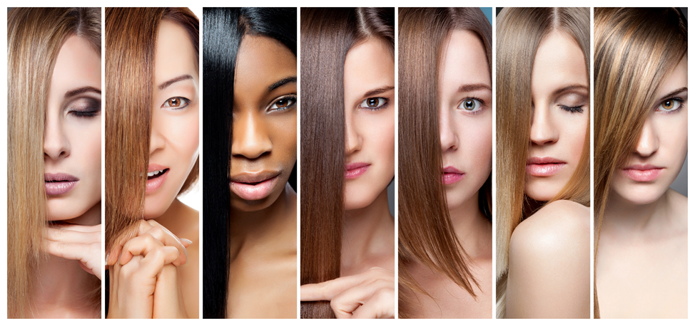
Why Skin Tones Are So Easy to Get Wrong
Cameras don’t see colour the way humans do. Your brain automatically corrects for different lighting conditions. You can sit in a warm yellow room and still perceive a white shirt as white. Your camera doesn’t “know” what white is. It guesses. And that guess changes depending on the lighting, background, exposure, and even the colours in the scene.
Beauty photography is especially sensitive because:
- Skin has complex undertones (warm, cool, neutral, olive) that shift easily
- Makeup pigments are often saturated and can confuse auto white balance
- Reflective packaging and shiny skin can create colour casts
- The same product can look different under different light temperatures
- Phones and cameras aggressively apply processing, often without telling you
If you rely entirely on automatic settings and quick edits, you’ll get “close enough” sometimes, but consistency will be hard. The goal is to reduce how much your camera has to guess.
The Foundation: Use One Light Source (Avoid Mixed Lighting)
Mixed lighting is the number one reason skin tones look wrong. It happens when you combine:
- Window daylight (usually cooler)
- Indoor bulbs (often warm)
- LED panels (varies, sometimes greenish)
- Ring lights (often cool, sometimes inconsistent)
When you mix different colour temperatures, your camera can’t set one correct white balance. Parts of the image will look too warm, too cool, or oddly tinted. Skin tones suffer first.
The fix: Choose one dominant light source and eliminate the rest.
If you shoot with window light:
- Turn off indoor lights
- Avoid shooting near coloured walls that reflect onto the face
- Use a diffuser (sheer curtain) to keep light soft and consistent
If you shoot with artificial light:
- Close curtains to reduce daylight contamination
- Use bulbs or LEDs with consistent colour temperature
- Keep the light setup the same for each session
Choose Lighting That Plays Nice With Skin Tones
Not all light sources render skin tones equally well. Even if the scene looks fine to your eyes, certain lights can introduce weird colour casts that are difficult to correct later.
Daylight window light is often the easiest for accurate colour:
- It’s broad-spectrum and naturally balanced
- It tends to render skin tones well
- It’s free and widely available
But window light changes:
- Morning vs afternoon shifts the colour temperature
- Cloudy vs sunny changes intensity and softness
- Reflections from outside surfaces can tint light
Artificial lights can be consistent if chosen carefully:
- Look for lights with high colour rendering ability (often labeled CRI or TLCI)
- Avoid cheap LEDs that push green or magenta tints
- Use one consistent setting and don’t mix different brands of lights if possible
You don’t need perfect equipment. You need predictable equipment.
White Balance: The Most Important Skill for Accurate Skin Tone
White balance is how your camera decides what “neutral” looks like under your lighting. If white balance is off, skin will look too warm, too cool, or slightly greenish or magenta.
The problem with Auto White Balance (AWB):
AWB changes from shot to shot. If you photograph a bright red lipstick, AWB may compensate and shift skin tones. If you photograph a white jar on a beige background, AWB may behave differently. That’s why your images can look inconsistent even in the same room.
The fix: Use a consistent white balance.
How to do this on a phone:
- Turn off filters and beauty modes
- Use a camera app that allows white balance control if possible
- If you can’t set WB, keep your setup consistent and correct in editing using a reference
How to do this on a camera:
- Set a custom white balance using a neutral reference
- Or choose a Kelvin value that matches your light source and keep it consistent
The Secret Weapon: Use a Neutral Reference
If you want skin tones right every time, give yourself a neutral anchor.
Simple neutral references:
- A gray card (best)
- A white card that is truly neutral (not creamy or tinted)
- A colour checker chart (best for advanced consistency)
How to use it:
- Take a reference shot with the gray card in the same light as your subject
- In editing, use the white balance picker on the gray card
- Apply the same correction to the rest of the images from that session
This one habit can dramatically improve consistency. It removes guesswork and gives you a repeatable baseline.
Background and Wardrobe Can Tint Skin (Yes, Really)
Colour reflects. If you shoot against a bright green wall, some green light will bounce onto skin. If your subject wears a bright red top, that colour can reflect upward into the jawline and cheeks. Even a strong coloured backdrop can shift how your camera exposes and balances the scene.
To protect skin tones:
- Use neutral backgrounds when colour accuracy matters
- Avoid strong coloured surfaces near the face
- Use white boards to bounce neutral light back onto skin
- If you want colourful backgrounds, keep them farther away and light the face separately
For product shots and swatches, neutral backgrounds are especially useful because they make it easier to compare shades accurately across a series.
Exposure: Don’t Blow Highlights or Crush Shadows
Skin tone accuracy isn’t only about white balance. It’s also about exposure. Overexposure can wash out skin and erase nuance in undertones. Underexposure can make skin look muddy or overly saturated.
Practical exposure tips:
- Slightly underexpose rather than overexpose, especially on shiny skin
- Protect highlights on forehead, nose, and cheekbones
- Avoid deep shadows that lose detail in darker skin tones
- Use fill light (a white reflector) to lift shadows gently rather than brightening in editing
If your phone allows exposure lock:
- Tap to focus on the skin
- Reduce exposure slightly
- Keep that setting for the set
Photographing a Range of Skin Tones Ethically and Accurately
Accurate colour is especially important when photographing diverse skin tones. Two common problems show up:
- Darker skin gets underexposed, losing richness and detail
- Lighter skin gets overexposed, losing blush and undertone nuance
The answer is not one universal exposure. The answer is mindful exposure per subject while keeping your lighting and white balance consistent.
Best practices:
- Use soft, even light with gentle fill
- Meter and expose for the face, not the background
- Avoid harsh overhead light that creates deep shadows
- Keep edits subtle and avoid shifting skin tone toward unrealistic warmth or coolness
If you’re photographing multiple people in the same set, a consistent lighting setup and a neutral reference become even more important. It helps you keep the entire series coherent without “correcting” skin tones into the same narrow range.
Editing Without Breaking Skin Tones
Editing is where many colour problems begin. It’s easy to push an image “a little warmer,” add contrast, boost saturation, and suddenly skin looks like a different person.
A safer editing workflow for beauty colour accuracy:
- Set white balance first using a neutral reference
- Adjust exposure gently to match real-life brightness
- Reduce highlights if skin looks shiny or blown out
- Lift shadows slightly if you’re losing detail
- Use contrast carefully, too much contrast can make skin look harsh
- Adjust saturation gently, or use vibrance rather than saturation if available
- Check skin tone consistency across multiple images in the set
Avoid heavy use of:
- Orange/teal colour grading presets
- Overly warm filters
- Selective colour edits that change skin hue
- Strong clarity and texture adjustments that exaggerate pores and fine lines unless that’s the intent
If you use presets, build one specifically for your lighting setup and apply it consistently. Don’t swap presets between shoots and expect stable skin tones.
Calibrate Your Viewing Environment (So You’re Not Editing Blind)
Here’s the uncomfortable truth: you might be editing accurately, but your screen could be lying to you. Phones and laptops can shift colour based on night mode, True Tone, blue light filters, and automatic brightness.
To reduce surprises:
- Turn off night shift or blue light filters when editing
- Edit at a consistent brightness level
- Check your final images on at least two devices
- If you work professionally, consider calibrating your monitor
You don’t have to become a colour scientist, but you do need to make sure your screen isn’t injecting warm or cool bias into your decisions.
Consistency Across Shoots: Build a “Colour Routine”
If you want “every time” results, build a repeatable routine.
A practical colour routine:
- Shoot in the same place (same window or same light)
- Use the same background and reflectors
- Take one reference shot with a gray card each session
- Use the same editing steps and avoid heavy filters
- Compare new edits to a “gold standard” image you trust
This is how professional beauty brands maintain consistency across campaigns. It’s not magic. Its process.
Where Stock Images Can Help (Without Confusing Colour Standards)
If you’re creating educational content, mood boards, or blog posts, royalty-free stock photos can be useful in a positive way for illustrating general concepts, like examples of lighting setups, neutral backgrounds, or colour temperature differences. Just be careful not to use stock imagery as evidence of your product’s exact shade or results, because colour accuracy should be based on your own controlled photos of the real subject.
Quick Troubleshooting: Common Skin Tone Problems and Fixes
Problem: Skin looks too yellow or orange
Fix: White balance is too warm. Cool it slightly. Check that your “white” background isn’t actually cream-coloured.
Problem: Skin looks too pink or red
Fix: White balance may be too cool, or you may have increased saturation. Reduce warmth adjustments and check exposure.
Problem: Skin looks greenish or sickly
Fix: Some LEDs shift green. Adjust tint toward magenta in editing. Consider a better light source or bounce/diffusion.
Problem: Skin looks gray or dull
Fix: Underexposure or crushed shadows. Lift exposure slightly and add gentle fill light in the shoot next time.
Problem: Foundation swatches look inconsistent
Fix: Use the same lighting and white balance, and include a neutral reference. Don’t rely on AWB for swatch work.
The Bottom Line
Getting skin tones right every time is less about having expensive gear and more about having a repeatable colour workflow. Use one light source. Avoid mixed lighting. Diffuse your light for softness. Set consistent white balance. Use a neutral reference. Edit gently and consistently. Check your images on multiple devices.
When you do this, your beauty photos start to feel trustworthy. And in beauty, trust is the premium finish. It’s what makes people believe what they’re seeing, whether they’re evaluating a skincare result, choosing a foundation shade, or deciding if a lipstick is truly the rosy nude they’ve been hunting for.


